
Why Accessibility Improves Product Quality for Everyone
Connect accessibility to clearer structure, keyboard support, contrast, semantics, and resilient interfaces. Read a practical framework from CodersDive.

Why Accessibility Improves Product Quality for Everyone is not mainly a technology question. It is a decision about clarity, hierarchy, feedback, accessibility, and performance. Teams get into trouble when they select a tool or feature before agreeing on the business behavior that needs to change. Connect accessibility to clearer structure, keyboard support, contrast, semantics, and resilient interfaces.
Start with the decision, not the tool
The useful starting point is to describe the current situation in plain language. Who is trying to do what? What slows them down? What information do they need? What happens when the normal path breaks? A good answer exposes the real constraint. It may be missing context, weak trust, unclear ownership, inconsistent data, or an experience that asks too much before delivering value.
Define the outcome in observable terms
Then translate the problem into a measurable product or operational outcome. Avoid goals such as "use AI," "modernize," or "improve the UX." Prefer a statement such as: reduce the time required to complete a task, increase the percentage of users reaching a meaningful milestone, lower preventable errors, or give operators reliable visibility into exceptions. A concrete outcome gives the team a way to compare options and say no to attractive distractions.
A practical framework
A practical framework is:
- 1Start with the user's task
- 1Make priority visible
- 1Design every state
- 1Reduce interaction cost
- 1Test on real devices and constraints
The failure mode to watch
The most common failure is treating the visible interface as the whole solution. In reality, the result depends on the surrounding system: data quality, permissions, integrations, ownership, support, analytics, and the behavior of people who must adopt it. A polished screen cannot compensate for a workflow that remains unclear or a system nobody trusts.
Protect the learning in the first release
For a first release, protect the learning objective. Build only enough to test the central assumption with realistic users and operating conditions. Define what success, failure, and "needs another iteration" look like before launch. That makes the project a controlled decision rather than an expensive act of optimism.
Final thought
The right answer to why accessibility improves product quality for everyone is rarely a universal best practice. It is the approach that fits the product stage, risk, users, operating model, and evidence available now. CodersDive helps teams turn that context into a focused plan, a credible release, and a system they can continue to own.
focused discovery or product engineering engagement.
Moving beyond compliance requires viewing accessibility as a technical constraint that forces better engineering decisions and more resilient interface logic. When accessibility is treated as a core architectural requirement rather than a UI layer, the resulting product is inherently more stable and easier to maintain.
Semantic HTML as a Performance and SEO Lever
Engineering teams often overlook the direct correlation between semantic structure and product discoverability. Using the correct ARIA roles and HTML5 tags does more than assist screen readers; it defines the document object model (DOM) in a way that search engine crawlers and automated testing tools can parse with high efficiency. When a developer substitutes a generic `div` with a `main`, `nav`, or `article` tag, they reduce the cognitive load for future developers onboarding to the codebase.
Consider a data-heavy dashboard. Using a standard `table` element with properly defined headers (`th`) and scopes ensures that screen readers can navigate cell relationships. Simultaneously, this structure allows data scrapers and internal automation scripts to interact with the data without fragile Xpath selectors.
Decision criteria for semantic implementation: 1. Interactive elements: If an element performs an action, use a `button`. If it changes the URL or moves focus to a different section, use an `a` tag. Never use a `div` with a click listener. 2. Heading hierarchy: Ensure headings follow a logical nested order (H2 to H3). Skipping levels breaks the document outline for assistive tech and signals poor information architecture to search engines. 3. Form labels: Every input must have a programmatically linked `label`. This increases the clickable hit area for all users, improving UX on mobile devices consistently.
Keyboard Navigation: The Ultimate Stress Test for Logic
Keyboard-only navigation is frequently the first feature to break in complex SPAs (Single Page Applications). However, building a product that is fully navigable via Tab and Arrow keys forces an engineering team to resolve "z-index hell" and focus management issues that otherwise manifest as ghost bugs in production.
A common scenario involves modal windows. A poorly engineered modal allows the user’s focus to remain on the background layer, leading to accidental form submissions or data entry errors. Forcing "focus traps" and clear `:focus-visible` states ensures that the application state is always synchronized with what the user sees.
Signals of high-quality keyboard support: * Focus indicators: High-contrast rings that appear only on keyboard interaction, preventing UI clutter for mouse users while providing a clear "You Are Here" marker for power users. * Skip links: A hidden "Skip to content" link that appears on the first tab. This saves time for keyboard users and forces developers to define exactly where the "main" content begins. * Logical tab order: The focus follows the visual flow. If it jumps haphazardly, it usually indicates a CSS `order` or `absolute` positioning abuse that will eventually lead to layout shifts and performance degradation.
Resilient UI Patterns and Contrast Ratios
Designing for high contrast and scalable text (WCAG 2.1 AA standards) directly addresses environmental limitations that affect all users: glare on a mobile screen in sunlight, low-quality projectors in boardrooms, or age-related vision decline in high-value stakeholders.
When you enforce a minimum 4.5:1 contrast ratio, you eliminate the "vibrant but unreadable" design trap. Furthermore, supporting text resizing up to 200% without loss of functionality serves as a rigorous test for your frontend's responsiveness. If a layout breaks when text is enlarged, the container logic is brittle. Moving from fixed pixel heights to relative units like `rem` or `em` creates a fluid layout that survives different browser settings and device types.
Metrics to monitor for interface resilience: * Lighthouse Accessibility Score: Aim for a consistent 95+ to capture low-hanging structural errors. * Error Rate by Input Type: Track if users on mobile (small hit targets) have higher form validation failure rates than desktop users. This often points to poor touch-target sizing, an accessibility fundamental. * Time-to-Task Completion: Compare power users (keyboard) vs. standard users (mouse). A narrow delta indicates a highly efficient, accessible interface.
Frequently asked questions
Does prioritizing accessibility slow down the initial development sprint? While there is a marginal increase in time during the initial component design phase, it significantly reduces the long-term technical debt associated with refactoring non-semantic code. It is significantly cheaper to include ARIA labels and keyboard logic during the build than to audit and patch a completed product under the pressure of a compliance deadline.
How does accessibility impact mobile-first product strategies? Accessibility and mobile responsiveness are two sides of the same coin. Features like large touch targets (minimum 44x44 pixels), high contrast, and simplified navigation menus benefit mobile users who are often distracted or in sub-optimal lighting conditions. Accessible apps are, by definition, more usable on smaller screens.
Can a product be accessible if it uses high-end animations and complex data visualizations? Yes, provided there are functional fallbacks. High-end animations should respect the `prefers-reduced-motion` CSS media query for users with vestibular disorders. For complex visualizations, providing an alternative "Data Table" view ensures the information is accessible to screen readers while also serving users who need to export or copy raw data for their own workflows.
Have a similar decision in front of you? Talk to CodersDive about a focused discovery or product engineering engagement.
Discuss your product Web, Mobile & UX
What Makes a Website Feel Premium?
Break premium perception into hierarchy, spacing, type, motion, specificity, proof, and restraint. Read a practical framework from CodersDive.
 Web, Mobile & UX
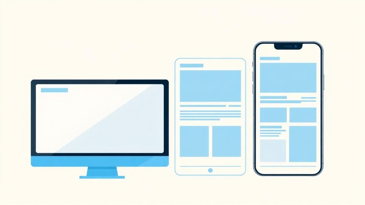
Responsive Design Is More Than Shrinking Desktop
Design task priority, navigation, content order, and interaction specifically for smaller screens. Read a practical framework from CodersDive.
 Web, Mobile & UX
How to Improve a Landing Page Without Redesigning Everything
Use message clarity, proof, CTA hierarchy, friction removal, and performance improvements. Read a practical framework from CodersDive.