
How to Improve a Landing Page Without Redesigning Everything
Use message clarity, proof, CTA hierarchy, friction removal, and performance improvements. Read a practical framework from CodersDive.
How to Improve a Landing Page Without Redesigning Everything is not mainly a technology question. It is a decision about clarity, hierarchy, feedback, accessibility, and performance. Teams get into trouble when they select a tool or feature before agreeing on the business behavior that needs to change. Use message clarity, proof, CTA hierarchy, friction removal, and performance improvements.
Start with the decision, not the tool
The useful starting point is to describe the current situation in plain language. Who is trying to do what? What slows them down? What information do they need? What happens when the normal path breaks? A good answer exposes the real constraint. It may be missing context, weak trust, unclear ownership, inconsistent data, or an experience that asks too much before delivering value.
Define the outcome in observable terms
Then translate the problem into a measurable product or operational outcome. Avoid goals such as "use AI," "modernize," or "improve the UX." Prefer a statement such as: reduce the time required to complete a task, increase the percentage of users reaching a meaningful milestone, lower preventable errors, or give operators reliable visibility into exceptions. A concrete outcome gives the team a way to compare options and say no to attractive distractions.
A practical framework
A practical framework is:
- 1Start with the user's task
- 1Make priority visible
- 1Design every state
- 1Reduce interaction cost
- 1Test on real devices and constraints
The failure mode to watch
The most common failure is treating the visible interface as the whole solution. In reality, the result depends on the surrounding system: data quality, permissions, integrations, ownership, support, analytics, and the behavior of people who must adopt it. A polished screen cannot compensate for a workflow that remains unclear or a system nobody trusts.
Protect the learning in the first release
For a first release, protect the learning objective. Build only enough to test the central assumption with realistic users and operating conditions. Define what success, failure, and "needs another iteration" look like before launch. That makes the project a controlled decision rather than an expensive act of optimism.
Final thought
The right answer to how to improve a landing page without redesigning everything is rarely a universal best practice. It is the approach that fits the product stage, risk, users, operating model, and evidence available now. CodersDive helps teams turn that context into a focused plan, a credible release, and a system they can continue to own.
focused discovery or product engineering engagement.
Structural layout and aesthetics matter, but the highest leverage improvements often lie in the logical architecture of your existing assets. By refining the hierarchy of information and stripping away cognitive load, you can force a lift in conversion rates without opening a Figma file for a total overhaul.
Optimise the information hierarchy for "Scan-First" reading
Most landing pages fail because they assume the user reads from top to bottom. Heatmap data consistently shows that users scan in F-patterns or Z-patterns, looking for anchors that validate their intent. If your page is a wall of text, the visitor will bounce before they reach your primary value proposition. Instead of rewriting every word, reorganise the existing blocks to match the user's mental model.
Start by auditing your H2s. They should tell the entire story of the product if the body text were deleted. If an H2 says "Features" or "How it Works," it is a wasted opportunity. Change it to a benefit-driven statement like "Automate your payroll in three clicks." This provides instant value even to someone scrolling at high speed.
The Trade-off: High-density information environments provide more "SEO juice" but often dilute the conversion signal. If you have a complex B2B product, you may need to move long-form technical specifications into a collapsible "Technical Specs" drawer or a separate documentation link to keep the landing page focused on the decision-maker's primary pain points.
Metrics to watch: - Scroll Depth: If 70% of users drop off before the first social proof block, move that block up. - Dwell Time per Section: Use tools like PostHog or Hotjar to see which sections are being ignored and cut them entirely.
Reduce micro-friction in the conversion path
Redesigns often focus on the "big" elements like hero images, but conversion leaks are usually found in the micro-interactions. Friction is anything that makes a user pause to think. A common example is a CTA button that asks for too much commitment too early, such as "Start Enterprise Trial" for a top-of-funnel visitor.
Review your primary form or checkout flow. Every field you remove increases the conversion rate by a measurable percentage. If you cannot remove a field, use smart defaults.
Decision criteria for form fields: 1. Is this required for the lead to be routeable? (e.g., Email) -> Keep. 2. Can this be enriched via a third-party API later? (e.g., Company size, Industry) -> Remove. 3. Is this for the benefit of Sales or the User? -> If Sales, move it to the thank-you page or a follow-up email.
Another friction point is "Choice Overload." If your navigation menu is visible on the landing page, you are giving the user ten ways to leave the conversion funnels. Experiment with a "ghosted" or minimal header that only contains your logo and a single CTA button. This keeps the user's focus locked on the path you have designed for them.
Implement high-signal social proof placement
Most teams treat social proof as a "checkbox" item, placing a row of logos at the bottom of the page. To improve a page without a redesign, move your proof elements to the points of highest friction—usually right next to the CTA or immediately below the hero statement.
Generic testimonials like "Great service!" are useless. You need "Outcome Proof" that addresses specific objections. If your product is perceived as expensive, your social proof should highlight ROI. If it is perceived as difficult to set up, use a quote about how fast the implementation was.
Concrete Scenario: A SaaS company noticed a high drop-off at the pricing table. Instead of redesigning the table, they added a single line of micro-copy beneath the "Purchase" button: *"Joined by 450+ engineering teams this month."* This small tactical addition provides the necessary safety signal at the exact moment the user feels the most risk.
Checklist for effective social proof: - [ ] Are logos greyscale to avoid distracting from the brand? - [ ] Do testimonials include a full name, title, and verified company? - [ ] Is the proof relevant to the specific claim made in the section above it? - [ ] Have you included a quantitative data point (e.g., "Saved 20 hours per week")?
Frequently asked questions
How do I decide which element to test first without a full redesign? Start with the "Big Rock" theory. The element that occupies the most visual real estate or is the closest to the conversion point will yield the most data. Usually, this means testing the Hero H1 headline or the primary CTA copy. Improving a headline that 100% of visitors see is more impactful than refining a footer that only 5% reach.
Is page speed more important than the actual content? Performance is a prerequisite for content. If your page takes longer than three seconds to load, your bounce rate will spike regardless of how persuasive your copy is. Before changing any design elements, compress your images, minify your CSS, and ensure you are using a global CDN. Technical performance is the highest-ROI "non-design" improvement you can make.
Should I use A/B testing for every small change? Only if you have sufficient traffic. A/B testing on a page with 500 visitors a month will take years to reach statistical significance. For low-traffic pages, rely on qualitative feedback, user session recordings, and heuristic audits. It is better to make a series of bold, informed changes based on best practices than to wait six months for a "winner" on a button colour test.
Have a similar decision in front of you? Talk to CodersDive about a focused discovery or product engineering engagement.
Discuss your product Web, Mobile & UX
What Makes a Website Feel Premium?
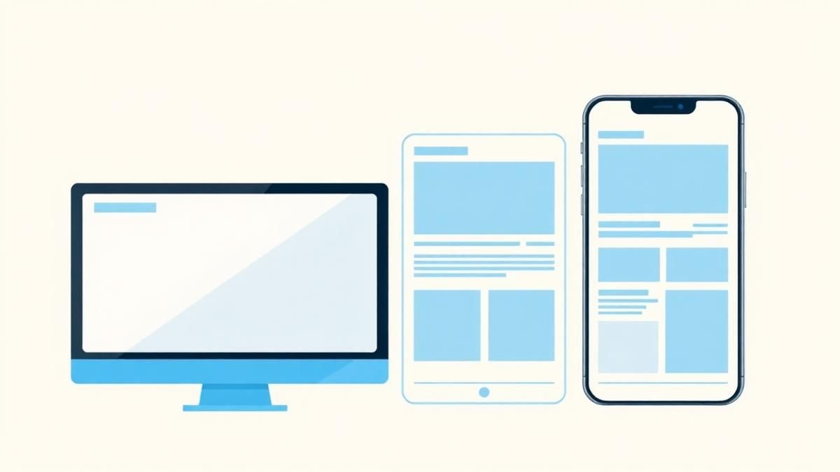
Break premium perception into hierarchy, spacing, type, motion, specificity, proof, and restraint. Read a practical framework from CodersDive.
 Web, Mobile & UX
Responsive Design Is More Than Shrinking Desktop
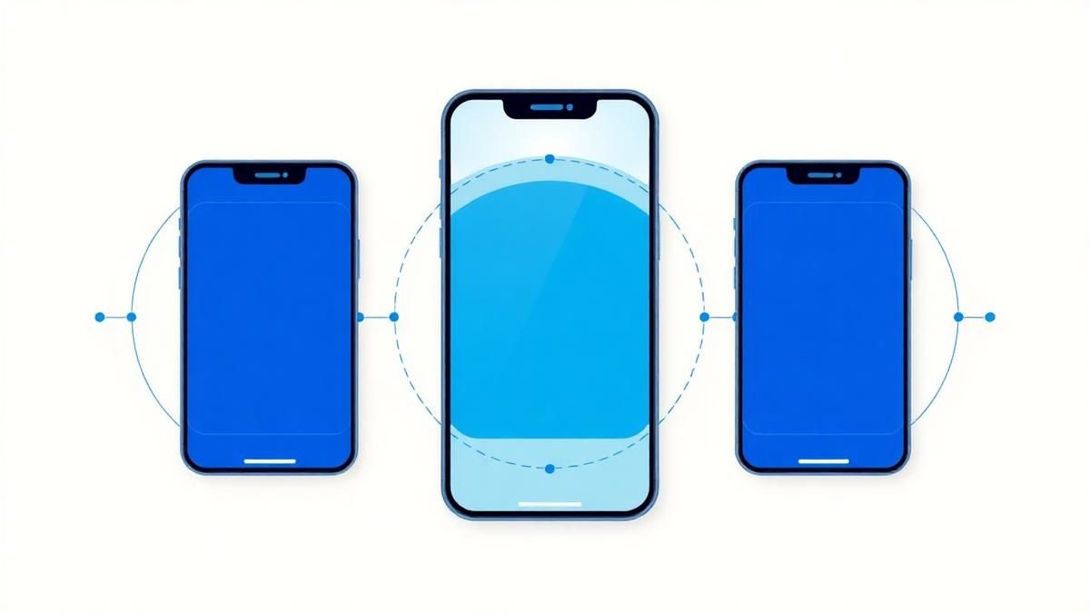
Design task priority, navigation, content order, and interaction specifically for smaller screens. Read a practical framework from CodersDive.
 Web, Mobile & UX
Native App, Cross-Platform App, or Progressive Web App?
Choose based on device capability, distribution, budget, update cadence, and user behavior. Read a practical framework from CodersDive.