
Design Systems for Small Teams: Start Smaller Than You Think
Build only the tokens and components needed for consistency and speed now. Read a practical framework from CodersDive.
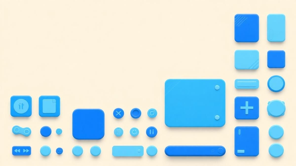
Design Systems for Small Teams: Start Smaller Than You Think is not mainly a technology question. It is a decision about clarity, hierarchy, feedback, accessibility, and performance. Teams get into trouble when they select a tool or feature before agreeing on the business behavior that needs to change. Build only the tokens and components needed for consistency and speed now.
Start with the decision, not the tool
The useful starting point is to describe the current situation in plain language. Who is trying to do what? What slows them down? What information do they need? What happens when the normal path breaks? A good answer exposes the real constraint. It may be missing context, weak trust, unclear ownership, inconsistent data, or an experience that asks too much before delivering value.
Define the outcome in observable terms
Then translate the problem into a measurable product or operational outcome. Avoid goals such as "use AI," "modernize," or "improve the UX." Prefer a statement such as: reduce the time required to complete a task, increase the percentage of users reaching a meaningful milestone, lower preventable errors, or give operators reliable visibility into exceptions. A concrete outcome gives the team a way to compare options and say no to attractive distractions.
A practical framework
A practical framework is:
- 1Start with the user's task
- 1Make priority visible
- 1Design every state
- 1Reduce interaction cost
- 1Test on real devices and constraints
The failure mode to watch
The most common failure is treating the visible interface as the whole solution. In reality, the result depends on the surrounding system: data quality, permissions, integrations, ownership, support, analytics, and the behavior of people who must adopt it. A polished screen cannot compensate for a workflow that remains unclear or a system nobody trusts.
Protect the learning in the first release
For a first release, protect the learning objective. Build only enough to test the central assumption with realistic users and operating conditions. Define what success, failure, and "needs another iteration" look like before launch. That makes the project a controlled decision rather than an expensive act of optimism.
Final thought
The right answer to design systems for small teams: start smaller than you think is rarely a universal best practice. It is the approach that fits the product stage, risk, users, operating model, and evidence available now. CodersDive helps teams turn that context into a focused plan, a credible release, and a system they can continue to own.
focused discovery or product engineering engagement.
The friction in maintaining a design system often stems from over-engineering prematurely—building components for theoretical use cases rather than existing workflows. For a small team, the primary goal is not comprehensive documentation, but the reduction of decision fatigue across the product lifecycle.
Hard-coding tokens before components
Before building a single button component, small teams must standardise their design tokens. In a resource-constrained environment, the most common source of technical debt is not inconsistent components, but "magic numbers" distributed across CSS or styling objects. If your padding values vary by 2px across different views, a design system will fail to provide velocity because every new feature will still require bespoke alignment.
Start by auditing your codebase for hard-coded hex codes and spacing values. Instead of a 20-step colour scale, limit yourself to five: Brand, Success, Warning, Error, and Neutral—each with a single "Surface" and "Content" variant. By limiting these tokens, you force consistency at the root level. When a designer proposes a new shade of grey, the immediate engineering response should be to map it to an existing token or reject it based on accessibility requirements. This gatekeeping at the token level prevents the "component bloat" that typically kills small-team initiatives within six months.
The 'Rule of Three' for component abstraction
Small teams often fall into the trap of "pre-factoring"—abstracting a component into the design system before it has proven its utility. This creates a maintenance burden for components that may never be reused. To avoid this, implement a strict "Rule of Three" criteria:
- 1 Usage: A component must exist in at least three distinct contexts in the live application before it is eligible for promotion to the core library.
- 2 Variation: If a component requires more than three props to handle edge cases in its first month, it is too complex. Revert to a local implementation until the patterns stabilise.
- 3 Ownership: Every library component must have a clear "owner" who manages the documentation. If no one has the bandwidth to document the API, the component remains in the feature-specific folder.
Consider a "Promotional Banner" component. If it only appears on the dashboard, keep it in the dashboard folder. If it is then needed for the checkout and the settings page, move it to the design system. This "just-in-time" approach ensures the library stays lean and reflects actual product needs rather than aspirational ones.
Measuring system health on a budget
Complex metrics like "Component Coverage" or "Figma-to-Code Parity" are often too time-consuming for small teams to track. Instead, focus on architectural signals that indicate whether the system is helping or hindering your speed.
Watch for these three signals: * The Overwrite Ratio: If developers are frequently using `!important` or style overrides on library components, the components are either too rigid or poorly understood. A high overwrite ratio suggests the system is being fought, not used. * New Component Lead Time: Measure how long it takes to move a new element from a design mockup to a functional production component. If this takes longer than two sprints, the system’s abstraction layer is likely too heavy. * The Sticker Sheet Drift: Every month, compare your Figma library against your production storybook. If more than 15% of the visual properties differ, your design-to-code pipeline is broken.
Use a simple monthly health check. If the team feels like they are spending more time updating the system than shipping features, it is time to freeze the library and prune underused components.
Frequently asked questions
When is the right time to move from a shared CSS file to a formal component library? The transition should occur when you have more than two developers frequently stepping on each other's toes with global styles. If a change to a button's primary colour in one area of the app is causing unexpected regressions in another, you have reached the limits of a shared stylesheet. A formal library provides the encapsulation necessary to prevent these side effects, ensuring that changes are predictable and scoped correctly.
Should we use an off-the-shelf UI library instead of building our own? For small teams, yes—but with a caveat. Use an unstyled or "headless" library (like Radix UI or Headless UI) to handle complex logic like accessibility and keyboard navigation, while using your design tokens for the visual layer. This gives you the speed of a pre-built system without the technical debt of overriding a heavy, opinionated framework like Bootstrap or Material UI, which often requires significant effort to bend to your brand's unique identity.
How much documentation is actually necessary for a small team? Documentation should live where the work happens. Instead of a massive external wiki, document the component API using TypeScript types and JSDoc directly in the code. In Figma, use the description fields for components to link to the relevant code files. If a component is simple enough to understand by looking at its props, it doesn't need a page of written instructions. Prioritize "live examples" in a tool like Storybook over static documentation text.
Have a similar decision in front of you? Talk to CodersDive about a focused discovery or product engineering engagement.
Discuss your product Web, Mobile & UX
What Makes a Website Feel Premium?
Break premium perception into hierarchy, spacing, type, motion, specificity, proof, and restraint. Read a practical framework from CodersDive.
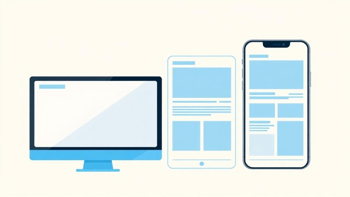 Web, Mobile & UX
Responsive Design Is More Than Shrinking Desktop
Design task priority, navigation, content order, and interaction specifically for smaller screens. Read a practical framework from CodersDive.
 Web, Mobile & UX
How to Improve a Landing Page Without Redesigning Everything
Use message clarity, proof, CTA hierarchy, friction removal, and performance improvements. Read a practical framework from CodersDive.